The glitter of gold, or rather its irrevocable sheen has been the universal theme stretching across market headlines and analyst reports in recent months. Talks of an increasing number of central banks –from the tiny island of Mauritius to the Indian tiger and the Asian Dragon – diversifying and upping the percentage of reserves held as gold brings to the forefront an important question -
Are we at the threshold of a crisis of confidence in the paper standard and if so, is the world headed back to the once-abandoned Gold standard?
Before we begin to logically reason out this spurt of interest in gold at $1000+ than at $750 at the beginning of the year, would like to throw some light on certain facts:
While the diversification to gold by central banks gets continually highlighted, is the financial world missing out an important truth ?– that, an international organization which oversees the global financial system with a particular eye on exchange rates and balance of payments of nations a.k.a. IMF should be doing just the opposite - selling its gold.
Nay-sayers may still debunk the above reasoning on the ground that the IMF continues to be one of the largest official holders of gold in the world and therefore its gold sales of 403 metric tones merely represents 13% of its total gold holdings. Even if they were true, isn’t it still a no-brainer that for every buyer, there ought to be a seller? .And since this is applicable even to commodities, if the whole world is suddenly evincing extraordinary interest in gold and buying it (and defacto selling dollar ), who exactly is selling that much to meet this voracious world demand.
The most often heard rationalization for the recent rise is that markets are sniffing a real threat of inflation or very simply a loss of purchasing power in the dollar. If this premise was true, then I believe that only a completely irrational being or very simply a fool would be out there selling his gold for the rest of the world to enjoy.
Fully convinced of the maxim that the primary job of the markets is to fool the maximum number of people the maximum possible number of times, I’m led to believe that this new rush for gold may infact fizzle out into a kind of bubble seen in oil just last year. $1300 is still reasonably probable, but should infact pave the way for a reversal in the fortunes of gold for atleast 1-1.5 years and to this end, a break below 1030 would serve as a key signal.
And why so?
The world at large, Asia in particular is known for its large holdings of US debt. While on one hand, talks are rife with them diversifying out of dollar, there is no denying of the fact that the appetite for US debt continues to grow, albeit at a slower pace
I often wonder if Asia is so blind so as to finance the US’s insatiable demand for credit, if it knew fully well that there could be a potential default? Or, is it so foolish to accumulate dollars, only to later diversify into something that is non dollar, fully taking on the cost of exchange risk.
Since the scenario of a sovereign default by the US is by no means inconceivable, in my opinion the dollar could actually rise in the face of a default before it falls.
Simply because before America defaults on its debt, it would first buy time in the form of a postponement of repayment commitments and this in itself could trigger a scramble for dollars amongst its creditors/world .This in turn should lead to a spectacular round strength in the dollar, for which creditor before deciding to write off a bad debt would not first demand it ? And since the debt is denominated in dollars, the dollar should rise and with it ideally bring down all commodities, gold in particular, and non dollar currencies, except the yen.
Finally let me leave you with one random wild thought: Namely, wouldn’t it actually be in the interests of the holders of dollar debt to see the dollar rise (and euro fall) to say, a level close to parity ( 1 Euro =1 $ ) as this would only facilitate their diversification efforts at virtually zero market risk, before allowing the dollar to fall freely?
May seem far-fetched at this point, that the euro should fall to a parity before being able to command 2 dollars in exchange. But given the enormity of the stakes involved, it may not be an impossibility either.
Surprising, that an age old classic blockbuster - McKenna’s Gold should be teaching a very valid lesson – that, the mad rush for gold could be killing. Eventually, only a few make it big in this game.
Think about it.
Wednesday, December 9, 2009
Tuesday, December 8, 2009
The Buck Stops Here….??!
In a week that had the dollar bears falling in line to hammer the last nail on the dollar’s coffin, the greenback sported a rebound that was impressive to say the least…. and all of it apparently over an employment report that showed a slight dip in the jobs lost.
If one were to refer to the recent catalog of market responses to events, “good news” in the US typically went hand in hand with risky assets soaring and the dollar falling. However, this time markets chose to focus on a different theme – and (intelligently?) established a logical re-linking of good news with a stronger dollar. So much for market fundamentals!
The key question is whether this is just a blip in the larger scheme of dollar weakness or is it something more radical in terms of sentiment shift in favour of the dollar.
A peek into the chart of price movements reveals two defining developments –one in the EURO/USD and the other in its virtual mirror reflection, namely the dollar index.
EURO/$

As can be seen, a multi month uptrend spanning from March 2009 stands violated. If this is confirmed with 2 more days close below the trendline, it could have serious implications; given the market’s maxim – longer a trend is in force, stronger will be the price action upon a breach of the underlying trend.
Any pullbacks are likely to be limited by the support turned resistance trendline, currently at 1.4950-1.50, ushering fresh selling pressures towards 1.4625 initially and 1.4430 eventually.
$ index

We’ve been of the view for sometime now, that the current (probable) C wave could end anywhere between 73 - 74 territory. The breakout that can be seen in the $ index chart reinforces the view that the two converging trend lines culminating into an ending diagonal pattern – could take the dollar index in the medium term (over the next 6-8 months) towards 80 - 81.
That said, the above view will hold only if the current breakout is not a false whipsaw – as typically December is notorious for its volatile swings – courtesy, thin markets.
USD/INR

With 46 territory offering formidable support for the dollar - 4 times in a row now, the rupee could trip all the way to the trendline resistance at 47.50, especially of 46.75 gives way on a closing basis.
Break of 47.50-47.60 would however be critical in defining a complete trend reversal of the down move from late March 2009.
Friday, November 20, 2009
Sensitive Index

Re-assessing the Sensitive Index from a wave perspective reveals that the rise from the March lows of sub 8000 has progressed in a 5 wave sequence. If the above wave count is right, then the impulse wave which tracks the direction of the larger trend may have possibly given over at 17530, paving way for the 3 wave corrective A-B-C decline to complete a typical 8 wave sequence. The A and B sub-wave seems to have been done, which leaves the final leg, C corrective pending.
The nature of the corrective pattern could emerge as a “zigzag” or a “flat” - the former retracing a lot more of the previous 5 wave than a simple flat.
While much of the investor class would be better disposed with a flat corrective, the odds may be stacked in favour of a ‘zigzag’ type – for the simple reason, there is also a gap which the market will need to fill, namely the ‘gapped up’ price move after the UPA thumped majority. While some pain is in store in the near term, the good news is that when this corrective wave has given over, it may be the next Big opportunity as the next 5 wave impulse sequence of a larger degree may be about to begin which has the potency of taking the index to new highs above 21000.
The only hitch will be if the index falls below the start of the wave 1 ( i.e. below 8000 again ) for then, the above count would stand negated.
Monday, November 2, 2009
Currency Outlook- 2nd November 2009
Euro

The European major has nicely corrected towards the rising medium term trendline – just below 1.47. In all likelihood, the euro will witness a bounce this week from the current levels back towards 1.4950-1.5020, which puts the very short term preferred strategy towards euro buys with tights stops below 1.4625.
That said, the impending rally may not extend too much beyond 1.5050 from a macro picture - even if it does extend it would only offer opportunities for shorting the pair or exiting out of current longs as a test of 1.4430 seems reasonable after the current rally.
STERLING
Since the last report, pound has marked gains although missing our target of 1.6740 by a cent. There is no reason to alter our bullish view yet, as it continues to stay bid above 1.61-1.62.

From an Elliot perspective, the 4th wave has probably concluded putting the odds for a shoot towards 1.74-1.75 to complete the 5 wave sequence in the coming weeks. Break above 1.6740 will confirm this bullish count.
Preferred Strategy: Longs with stops below 1.6150
Dollar/ Rupee

The dollar as expected retraced into the mid 47 before turning again. As noted in the last report, so long as price action remains capped below the falling trendline resistance, now at 48, bias would be in favour of the Indian unit with rallies offering opportunities to short the dollar for a move again towards 45.50 - 46.
Dollar Index
In the current week, we could see the dollar index dip again towards 74.15 from the current 76.20.

However, from an Elliot (macro) perspective, the dollar index appears to be in the last wave , namely the C wave in the broader A-B –C corrective sequence. If this wave count is true, the corrective C wave should ideally terminate around 73-74 and head for a multi week rally.
A convincing breach above the pink line - (50 day EMA) would be needed to confirm this reversal.
Monday, October 19, 2009
Pound

As the dust settles after a roller coaster surprise in the markets particularly the Indian currency market, it’s time again to reassess our views on the various currencies.
I begin with the Queen’s currency, for the simple reason that chart developments are commanding a greater sense of clarity for this pair than any other.
As can be seen from the chart above, there is a reversal bar confirmation in the dailies. Also the RSI (green line at the bottom) has broken a downtrend. This breakout in the RSI presages a similar breakout in the price (GBP) above the falling trendline –In which case we could see a move towards 1.6740 shortly.
From an Elliot wave perspective, the fall from 1.70 to 1.57 appears to have unfolded in a 3 wave fashion .And since a 3 waver is typical of a corrective price action, we could see the pound 5 wave rally in the medium term- possibly even beyond 1.70
EURO

Taking the (dollar) bull by its horns, the euro trounced it to multi month lows. While the larger trend is yet to show clear signs of a reversal, the rally could take a temporary breather .The divergence on the MACD (dailies) is suggestive of a waning of upside momentum for the euro.
Holding below 1.4980 could trigger an unwinding of euro longs, putting the target at 1.46-1.4630.
RUPEE

The rupee hogged much of the limelight gaining 5% in just about a fortnight. Breach below 46.70 is a critical development as this support was key in withstanding selling pressures for nearly 4 consecutive attacks, right from late November last year.
A significant breakthrough for the rupee such as this clearly tilts the strategy towards “sell upon rises” as against the erstwhile “buy upon dips” for the medium term. Possible targets of retracement would be 46.70, 47.30 and 47.50-47.80. So long as rallies are capped below the falling trendline (now at 48.11) , the bias would be in favour of the Indian unit.
Only and only upon a weekly close above 48.11-48.30 would sufficiently take the dollar out of the woods.
NOTE
There is considerable amount of negative sentiment towards the dollar – talks of it being replaced, dollar demise etc etc. In the past 5 years this has typically preceded major turns for the dollar .With the exception of pound and rupee which are still to catch up on the dollar index’s fall , the European currency may be closer to its fag end of the rally – given that the dollar index is oversold on multiple times –daily, weekly and monthly.
It is possible we have a scenario wherein dollar index gains, euro falls and rupee gains in the near to medium term
The reasoning or logic that tricked me into believing that the rupee’s near term direction was towards 49-50 was very simply this: if the dollar was holding above 48 despite the cross currency/commodity/ equity rally, then logically it should strengthen further when the asset classes correct. However, little did I know that the rupee was merely playing laggard and would simply follow the rest but with a time gap. If this is a lesson that the market is teaching –and a painful one at that, I am led to believe that while the near-medium term would be favorable for the rupee, it may not last indefinitely – for possibly after a 6 month gap after the dollar index reverses, the rupee may begin to turn back into weakness.
Friday, September 25, 2009
OIL Confirms Top

Further to the post on WTI Crude - August 26th, price has followed well our preferred view that oil was in its topping process.
A classic reversal pattern in oil confirms that the medium term uptrend that began from the March lows of 35 has ended. Price can fall to 58 conservatively. Any corrective moves from the current levels are unlikely to extend beyond 70-71.
Tuesday, September 15, 2009
The Chart Bears it all….

Is it any wonder that the Sensex is the acronym for the SENSITIVE INDEX.?
A sense of fear creeps in each time I voice a view on the benchmark index – for the simple reason that apart from serving as a barometer of business and investor confidence, it has been quite an impressive tutor in giving a lesson or two on humility. So sensitive, that each time I take a side with one of the two popular camps, the index has to first visit the opposing camp before it takes sides with me.
Markets have rallied further since my last report in August, where I suggested a possible top to have formed near 16100. My call then was for a move towards the lower end of 12000.
While I sit to reassess this view, with markets ruling strong at 16,400 currently, I’m clearly tempted to feel that calling for tops in the Sensex is perhaps an exercise in futility. However, the pattern that has unfolded in the charts visibly compels me not to succumb just yet.
This pattern better known as the diagonal triangle, is a special type of price action which typically occurs in the terminal part of a rally or fall which has moved too far or too fast. Price action gets to narrow down and is confined within two converging trend-lines.
Whenever such a pattern evolves, price usually breaks out in the opposing direction of the move immediately preceding it and usually price retraces back to at least the start of the triangle. In this case we could the index tanking downward.
A closer look at the chart above indicates that the current pattern is more or less emerging to be a mirror reflection of the pattern seen during Jan-March lows. There again, we saw index dropping to new lows in the form of a triangle, generating substantial feelings of pessimism – after which followed a sudden and sharp move to the upside.
Guess my wait for the index to finish its visit with my peers in the bull camp is fast coming to a close!
Wednesday, August 26, 2009
WTI Crude OIL

While price action is still above the rising trendline drawn from the 35 lows seen in early March 2009, the FUEL of economic growth –OIL may have topped out at 74!!
Reasons ??
• MACD divergence
• Price has near exactly retraced to the 38.2% retracement target and has been unable to breach it
While a test of 67 in pretty imminent, a break below 65 would serve to confirm the bet that oil has indeed made its intermediate top.
Implication is pretty straightforward – Dollar staging a comeback against commodities.
Indian Rupee

The USD/INR seems to be forming a clear double bottom pattern, which puts the odds in favour of the dollar. A sustained break of 48.90 should set the stage for a test of 50.20-50.40 near term .Given the recent range-bound movement in the pair, could expect to see a swift volatile move upon this breakout
Tuesday, August 18, 2009
Has the dollar made an important bottom?

The above chart traces the path of the dollar index-measures the dollar against a basket of currencies.
The move from April/May 2008 – 71 lows to near 90 in late March ’09 appears to have unfolded in 5 waves – IMPLUSE WAVE
To complete the Elliot pattern, there must be a 3 wave correction and the move from 90 to the recent 77.50 appears to have fitted into this 3 wave corrective pattern.
If the above wave count is right, then we could see the dollar beginning its next 5 wave impulse towards 90 conservatively.
Agreed, it may seem a little too early to call for a massive dollar rally in the upcoming months, especially given that the index is still trading below its 200 day EMA – however, we would get a clearer confirmation of the above wave count if in the next couple of weeks we get to see the index trade above 81.50
The path of least resistance at the moment is more towards dollar strength – which tilts the preferred strategy towards “buying the dollar on dips” rather than “selling upon rises”.
In case of any selling, selling dollars for the near maturities (3-5 months) would be preferred rather than longer tenures (5-12 months)
Tuesday, August 11, 2009
Dollar Index

A very interesting pattern seems to be emerging on the $ index – that of a price divergence, meaning that while the $ price (green line) has made a new low; the MACD indicator given at the bottom of the chart has not made a corresponding new low. This is indicative of the decreasing downside momentum in the dollar, suggesting that the odds favor short term dollar strength. A break above 80 would serve to cement dollar bullishness.
Sensitive Index

There’s every reason(s) (see below) to believe that the rally which started from 8000 in mid march may have formed a temporary top there setting the stage for a retracement anywhere between 38% and 50% of the entire rally.
• Divergence in the MACD (i.e. New high in price is not confirmed by a new high in the momentum indicator)- connotes bearishness
• Divergence in RSI
• Price unable to break above the long term rising trend-line
• 16100 is exactly the 61.8% retracement from 8000 low to 22000 peak
A classic confirmation of this intermediate top has been the occurrence of the reversal bar (highlighted in the chart below). Generally after the formation of reversal bars, there tends to be a move up before a larger decline .So from the current levels of 15100, we could see a move back towards 15500-15600 offering opportunities for partial booking of profits near term for entry at lower levels later

Ideally in this correction price will seek to fill the gap seen in the chart –lower end of 12000 or below.
Monday, August 3, 2009
Why the Current US recovery is Ephemeral ……..
The often read quote in recent times, apart from the “green shoots” phrase is that an increasing number of people are beginning to get convinced that “the worst of the recession is behind us”.
While I wish I could convince myself to join this camp, it seems virtually impossible to turn deaf to the all-too loud message conveyed by economic fundamentals and charting analysis - a perfect synchronization between two diverse thoughts of analysis – an occurrence extremely rare.
As the main culprit to the current mess is leverage, let us begin by assessing certain key statistics pertaining to US national debt:

As can be seen, while the absolute volume of debt owed by the Federal Govt. to the owners of US debt has been steadily increasing, debt as a percentage of total GDP declined following the years after WW II and reached its lowest level just in time when Reagan assumed office (early eighties). From thereon the absolute numbers nearly quadrupled for nearly twelve years through George Bush Sr. tenure.

While Clinton was credited as perhaps, the only man who left office without the guilt of adding to the annual debt, Bush Jr’s infamous polices catapulted the debt by nearly 85% from $5.7 trillion ( when he took office ) to $10.6 trillion ( left office )
Obama could create history for expanding the debt to levels not seen since the World War –back to an approximate 90% in 2009 and 100% of the GDP by 2012 or even by 2010 according to certain estimates.
Despite the extent of fiscal profligacy, it’s quite interesting to note that the US actually has what is called a Debt Ceiling to keep a check on the amount of leverage. At first glance this sounds great, but the only loophole is that they allow the ceiling to be raised higher …and all this backed with legislation!! As recently as February 2009, this ceiling was raised to $12.104 trillion by the American Recovery and Reinvestment Act of 2009.
The mere thought that everything that is produced as a nation goes effectively to repay and service its debt stands as the biggest, if not the scariest possible scenario for the world’s largest economy.
So are we talking in terms of the United States Of America going bankrupt?
Well, the only quote that comes to my mind at this point is this popular adage - “ As goes General Motors, so goes the United States of America….” What this means is that the US may be headed for a catastrophic collapse which will entail among other things – a potential default of sovereign debt together with a downgrade of the AAA rating and an unprecedented fall in the US equity markets probably toward sub 4000.
I’m writing at a time when the Dow has scaled past the 9000 barrier - the highest seen in 2009 and so, even a 4000 to most readers could seem improbable.
However, given that the “Too big to fail theory” went bonkers during the recent crises, I would stick my neck out and say that this rally may offer the greatest opportunity to exit out of US markets.
The whole sub-prime crises as we know it today began with an excessive build up of leverage or debt and the resultant downturn only went to prove that the risks associated with leverage can hardly be overstated.
The “toxic assets” on the balance sheets of most banks in the US (and elsewhere) were the main reasons for the freezing of credit markets and a dry-up of liquidity in the system. So when the Fed ran out of its ammunition of tweaking interest rates, it began purchasing these securities turned toxic and in-turn flushed in liquidity.
So when people talk of a recovery, the first question that hits my head is -Have these assets turned less toxic or have they vanished altogether? .
The truth is that nothing much has changed because instead of sitting on the balance sheet of banks, they are now cozily settled on the balance sheet of the Central bank of the USA. What’s more is that unless the housing market embarks on a sustainable recovery, it is difficult to envision any tangible reduction in the toxicity of these assets.
Also to be noted is that while banks may have done away with a portion of this poison from their financial statements, the actual extent or % transferred is not disclosed to public knowledge. A perfect case of a time bomb waiting to explode……
Technical Viewpoint:
From a scientific perspective of charting and wave reading, we see that price (Dow Jones) can rise to test the falling trend-line resistance at about 11,000 to 11,500 – which could be a corrective B wave.

If the reading is right, then the B wave will set the stage for the C wave in the direction opposite to the B wave – in this case down.
Since the C wave has the characteristic of being the longest wave in the larger scheme of the trend, the decline that is likely to follow post this rally will be swift and deep, targeting anywhere between 3500 and 4000
So what does it all mean for the dollar? While the most instinctive response would be to sell the dollar in such an eventuality; given the phenomenal ability of the world’s reserve currency to trick just about anyone, I wouldn’t be surprised to see the dollar resurging strong in the midst of economic gloom as it did in the recent sub-prime crisis.
As a final word, I’d like to end by saying that it’s not a question of whether or not a deeper crisis is about to unfold, it’s more a question of timing –WHEN???
It would do well for America to turn the search-light inward instead of pointing fingers at the rest of the world to ask itself a simple question - Can a problem which started with unchecked spending and therefore, debt be solved by taking on more debt…..?
Tuesday, July 14, 2009
Commodity-Equity Link - July 9th 2009
One of the key take - homes of the liquidity awash that followed after Alan Greenspan lowered interest rates to 1% was the high-pitch fever, which caught on to almost everything under the sun from Real estate to financial securities.
In this paper, we take a look at just two asset classes which claimed a huge share of the limelight when they sprung to dizzying heights sometime back- Commodities and Equities.
In order to get a long term perspective of how Commodities have moved vis-a vis the US stock markets, I have taken the following timeframes based on the data available
Oil -1990 till date
Gold -1996 till date and
Dow Jones: 1945 till date.
OIL

GOLD

DOW JONES

Almost instinctively, one can notice that the commodity segment and the equities witnessed a synchronized bull run into 2008 - the only difference being that the rise in commodities was steeper than that witnessed in the Dow during the period 1996 – 2008.The plunge which subsequently followed proved no different. While the moves have been closely correlated to each other, the pace of the decline has been the steepest in oil when compared to equities or gold.
Where do we go from here…..??
We will now zoom in on the price movement in the past one year for all three categories to look at what could possibly unfold in the markets going forward.
Lets begin with the ‘fuel’ling force of global economic growth, namely oil. In the chart given below, price is being well supported currently at the rising trend-line drawn from $35.We could see a pullback, possibly towards the recent highs of 75 once again.
OIL

However that said, the RSI indicator (in green) has given a downside break of the indicator trendline. The implication is that after a recovery, oil could dive again.
The Fibonacci retracement of the entire fall from 140 comes at the following levels:
77 (38.2% retracement)
90 (50%) retracement)
103 (61.8% retracement)
As part of the recovery, I do not rule out the possibility of an overshoot above $75 to the 50% retracement at $90.However after this, oil is more likely headed down than up. This has got serious implications, in that the current recovery for the US is fragile and will end when the majority is most convinced that the recession is behind us.
Age-old Hedge against Inflation –GOLD

For those of us who have been constantly told that there is no better hedge to inflation than gold, it is indeed surprising to see gold hesitate so much, each time it comes close to the $1000 mark……when it should have simply breezed past it to make new highs, given the backdrop of unending free money infusion by the Fed. Herein, maybe lies an important cue. Notwithstanding the fact that a possible 7 out of every 10 persons view inflation as the natural and inevitable consequence of such an unprecedented liquidity easing, gold somehow seems unconvinced……
I would therefore bet, that a break below 870 would only serve to confirm the worst fear of policymakers and businesses alike –which is of deflation. And this, I still think is probably what the United States is headed for in the coming years.
Lastly, taking a closer look at the very barometer of confidence, viz., the Dow Jones Industrial Average I would prefer to name the current recovery at best, as nothing more than a bear-market rally
Dow Jones

The Dow, as can be seen has taken a V-shaped recovery. Barring a dip towards 7000, the short term could see another recovery which could take the index towards 10,500-11,000 to test the trend-line resistance (in blue). This would render excellent opportunities for exit of US stocks. This recovery could be swift and while the exact timeframe may be difficult to call at present, I personally think that the levels are what matter and will be closely watching for reversal signs upon a progression to these targets.
When most retail players begin to jump into the market, trying to catch up on the lost rally, I think that will be a vital indication that the next slide down to the long-term trend-line support at 3500-4000 has begun.
Monday, June 8, 2009
BSE Sensex -4th June 2009

The BSE Sensitive index is likely to witness a good corrective retracement post a test of 15500-15600. The target area of correction could be in the zone of 11800-12300.
Multiple timeframes (daily and weeklies) are suggestive of overbought conditions as well, which confirms that the rally could be about to lose steam
Tracing the Yield Curve - 12th May 2009
The Treasury Yield curve is very simply, a graph that plots the relationship between yields to maturity and time to maturity for a group of bonds. The slope of this curve, particularly as a tool of prediction of things to come has been an item of debate and discussion for many years if not decades among economists and policy makers alike.
The central concept of the “Time value of Money” suggests that as the time to maturity of the bond increases, the yield or the return on the bond should increase, as bond – holders or the lenders demand a greater premium for parting away with cash for a longer timeframe.
On taking a retrospective closer look at the yield curve, some very interesting patterns emerged:
YEAR - 2006
I’ve resorted to a random selection of dates for the study and have taken the yield curve for U.S. Treasuries. The yield curve began its inversion as early as Feb 2006, with the far end yields beginning to witness a dip. The steady progression of the inversion through the year has been captured in the following series of 5 charts:


Initially ( in Feb 2006 through June 2006 ) while the far end of the curve dipped , it still continued to offer a higher return than the short term bonds.
However, by August 2006 (see below) the far term maturity bonds fetched almost an equivalent return as that of the short end of the curve. Significant here was that the medium term (1 year to 6 years) witnessed a sharp drop in yields, suggesting that the Federal Reserve could be cutting interest rates in the medium term (which incidentally only occurs during an economic contraction)


What started off as a mild dip in far end yields in the beginning of 2006 evolved into a full- blown inversion by late 2006 , with the far end of the curve offering significantly lower yields that the shorter end .
While such a development might seem like an aberration of the Principle of Time value of Money, the understanding from a Demand-Supply perspective would probably prove more convincing. When yields drop, (in this case far term), it means demand for such maturity bonds outstrips the supply of bonds, indicating that investors preferred to jump into long term treasuries as they sensed a probable peak in long term interest rates.
On a retrospective reading of the yield curve, it can be seen that it amazingly presaged an economic recession and that interest rates would fall. Exactly, a little more than a year from the yield inversion, we saw the Dow Jones peaking at 14,100 on Oct 2009 (see chart below ) .The impact on the real economy was evident much later towards mid to late 2008 (see chart on US GDP and Employment)
Dow Jones Industrial Average

US ADVANCE GDP –QoQ

US Non Farm Payrolls -Employment created/lost

YEAR - 2009
Pulling out the corresponding data for as recent as May 6th 2009, it can be seen that the Yield curve has once again moved into its normal curvature

What does it bode for the US economy?
In its broadest sense, a rising yield curve is reflective of markets expectation of interest rates increasing in the far end of the curve .This in itself could be foreshadowing any of the following:
An optimistic scenario of near term economic bounce or recovery as a result of the unprecedented liquidity infusion, which in-turn sparks (growth – led) inflation to edge up and interest rates to rise.
The case of cumulative deficits (trade, current and Budget account) reaching alarming proportions, whereby markets demand the US to pay up higher coupons (yields) to fund the bourgeoning deficits and keep alive the appetite for external financing of US deficits.
A hyper-inflationary scenario not caused by growth but by the fact that the dollar (in so much of excess supply) loses its value (a.k.a purchasing power) significantly – which in turn causes a sell off in US treasuries causing yields to rise – which is Markets way of saying “Give me more by way of current return to offset for the capital erosion ( weakening currency ) “
While the first case scenario would be the delight of every economic agent, the second and third possibilities appear more realistic given the massive expansion of the Fed’s balance sheet.
Tuesday, March 17, 2009
Indian Rupee

Tracing the USD/INR price movement ever since its break above the trend-line a year back, one finds the unfolding of the typical impulse Elliot wave pattern.
In the above evaluation, I’ve applied 2 major rules of Elliot wave principle , viz.
• The bottom of the fourth wave, which is a pullback, cannot overlap the peak of the first rally. If it does, then it’s not a fourth wave.
• The third wave is never the shortest wave
If the above wave count is right, it appears that despite things looking extremely bleak for the rupee, we may in fact be in the final 5th wave of the impulse that should set the stage for a 3 wave corrective rally (rupee appreciation) that should typically ensue to complete the elliot pattern.
Where the 5th wave would end is still at the moment a wild guess, given that there are no overhead resistances to refer to, but by applying Fibo ratios to project, the following emerges as key probable areas of topping:
53.30, 54.50 and 55.40
OIL

Oil has staged a near perfect reversal of the multi month trend that was in existence since its peak in late July 2008. The above chart resembles very closely to the USD/INR fall from 47 to 39 and its bottom there.
Further confirmation –
• for the first time since Aug 2008, price has managed to close above the key 55 day EMA for 4 consecutive sessions.
• there is also a double bottom formation which puts the immediate minimum target at $65
Since price has reversed a multi month trendline, the momentum and velocity of the impending rally in oil is likely to be very high.
From a risk management perspective, it would be ideal for oil companies to hedge out their exposure for the next 6 months.
Tuesday, March 3, 2009
Lots in a NAME!!!

It’s quite uncanny that the direction of the financial markets and particularly the US economy is contained, atleast in part, in the three letters that define the most watched barometer of confidence. Is it any wonder that this benchmark average is named one letter short of the impending direction of the stock markets…….. DOWn.
Mirth aside, the chart pattern on a multi year framework beginning with the Great Depression paints a scary Double Top formation - a pattern that is seen by chartists as the most reliable sign that a deep downside attack is in store. By this pattern the Dow should have no hindrances in testing anywhere between 3500 and 4000 which coincides with the long term trendline.
Sadly, this only underscores the fact that the United States may be about to encounter one of the worst scourges of Asset price deflation.
I’m writing at a time when a haunting and seemingly never-ending dollar strength is playing out in the most vehement and convincing manner across the board except gold. The break of 7182 in the DOW Jones, only means that there will be further bank collapses, more bail outs and more dollars being pumped in. And this in itself could be the prelude for a precipitous fall in the dollar value, simply because the US would have printed so many dollars like there is no tomorrow only to find a deluge of dollars and its value evaporating in no time.
Thursday, February 5, 2009
The Japanese Experience
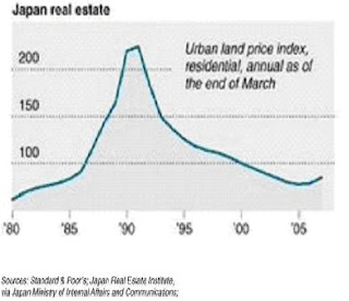
The nineteen eighties saw
Chart 1
Coming to equities, as can be seen from the chart 2 below The Nikkei hit a high of 38,957 in Dec 1989 and ushered in a prolonged period of contraction.
Chart 2

Japanese Banks-
Between 1987 and 1989 city banks issued nearly 6 trillion Yen of equity and equity-related securities. Things soured with the crash in 1990 and banks scurried to maintain the BIS required 8% capital ratio. The number of regional banks that could meet the 8 percent ratio declined from 50 in March of 1990 to 4 in September of that year.
One blunder only gave rise to further. Banks, which had adopted “keeping fingers crossed policy “ to hedge against downside risks were then permitted by the Ministry of Finance to issue junk bonds to remedy the banks capital problem
Apart from this, Japanese banks borrowed extensively in the Euro-dollar markets during the bubble period - an estimated 186 trillion Yen by June 1990.This was in turn used to finance a number of leveraged buyouts (LBO).
Banks also lent heavily with land as collateral and unfortunately did most of their lending in the peak of the real estate market and consequently suffered extensive losses when property values declined and loans went bad.
Yet another important observation pertains to the provisioning for NPA’s. In
Drawing Lessons……
Chart 3
 Many monetarists and other well-meaning economists including Ben Bernanke are quick to dismiss the possibility of deflationary whirlwind storming the

Apparently every attempt by the BOJ in the form of cutting key policy rates and easing liquidity through printing money proved fultile. As made evident by the chart 4 below,
Chart 4

FINAL ANALYSIS
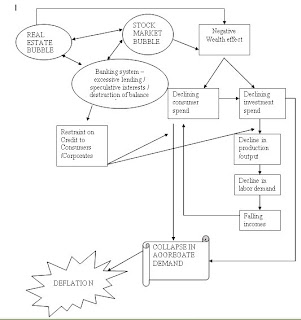
Interestingly it is worth noting that the genesis of a deflationary crisis, most often than not begins with asset bubble(s) coming apart.
Subscribe to:
Comments (Atom)